Palace of Works / Graphic Design / Branding
Competition · 2025
JAL Rebranding
Year 2025
Context Competition
With Yizhi Zhang
Room Graphic Design
Type Brand identity
Awards
INDIGO Design Award 2025 — Gold · Airline
INDIGO Design Award 2025 — Silver · Branding
MUSE Design Awards 2025 — Silver
Graphis New Talent Awards 2025 — Silver
Spark Awards 2025 — Bronze
IDA Design Awards 2025 — Honorable Mention
About
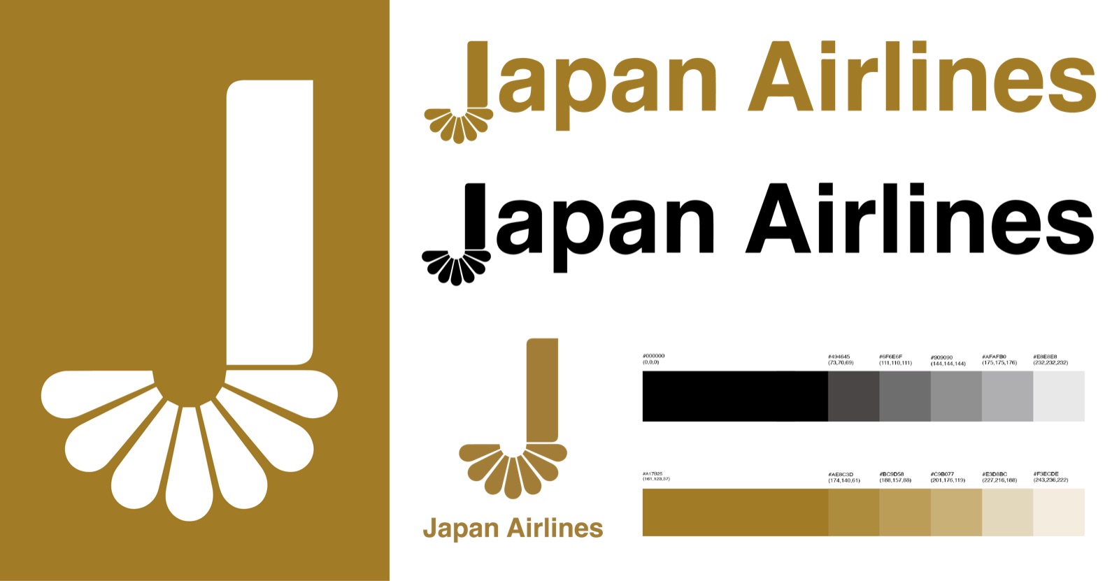
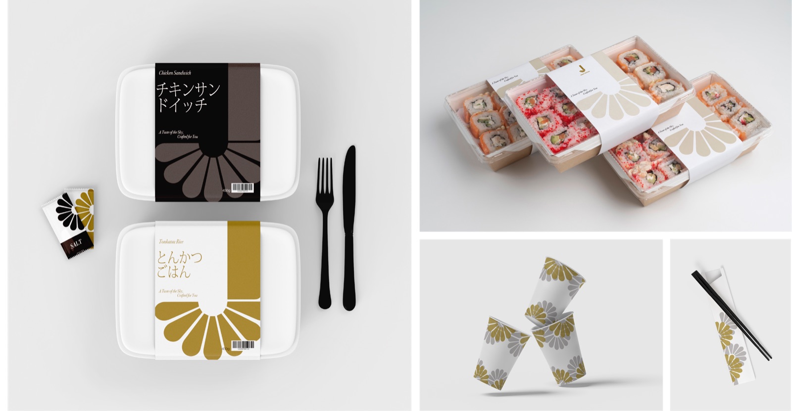
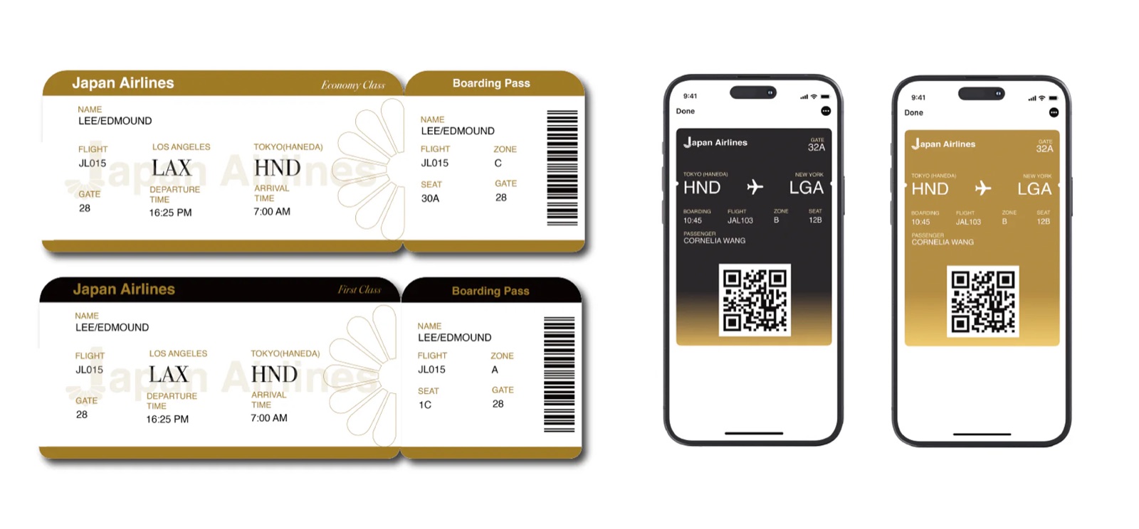
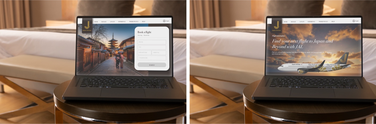
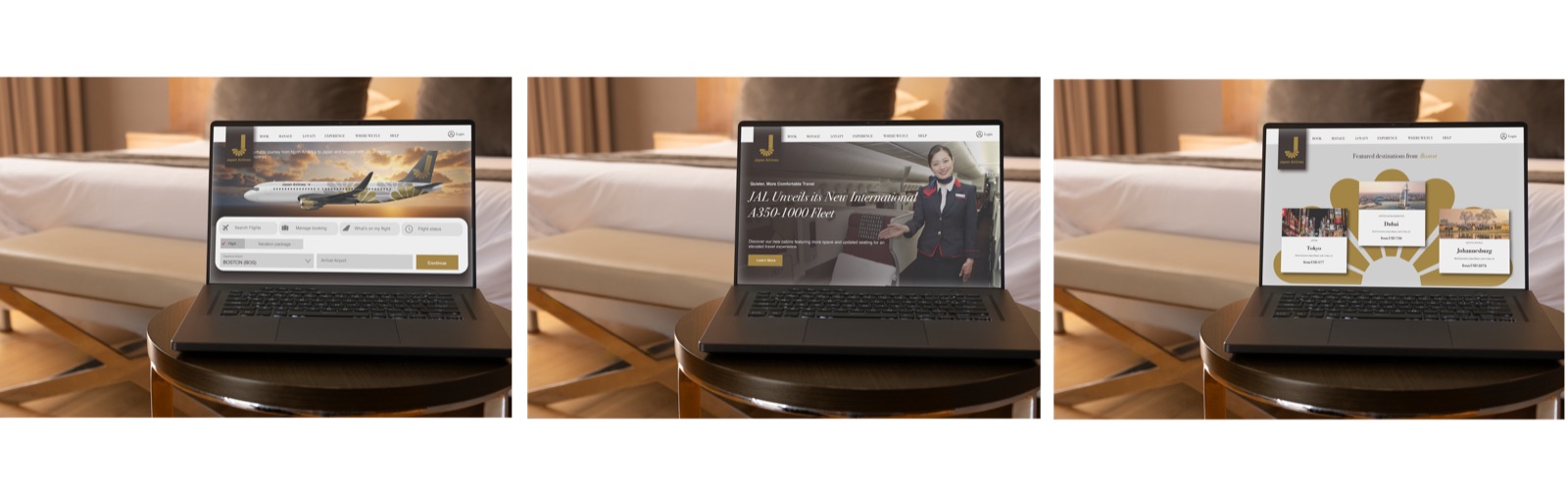
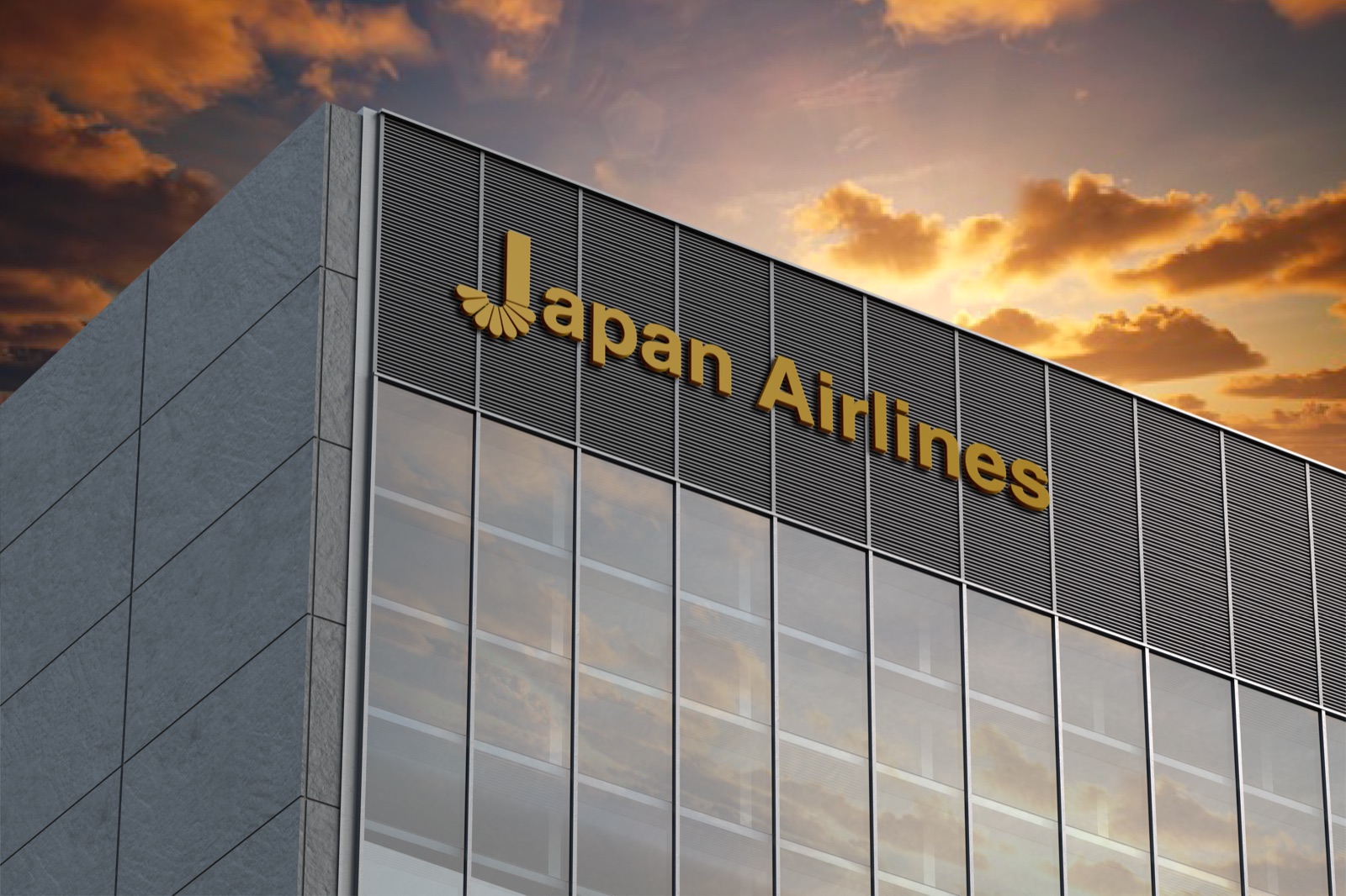
A modernized rebranding of Japan’s traditional airline, made with Yizhi Zhang for a competition. The chrysanthemum becomes the base of the J — heritage kept, redrawn in gold and black for a global audience, and carried from the wordmark to dining, boarding passes and the website. In 2025 it won Gold (Airline) and Silver (Branding) at the INDIGO Design Award, Silver at the MUSE Design Awards and the Graphis New Talent Awards, Bronze at the Spark Awards, and an Honorable Mention at the IDA Design Awards.