Palace of Works / Graphic Design / Branding
Competition · 2025
Kew Gardens Brand Identity
Year 2025
Context Competition
With Yizhi Zhang
Room Graphic Design
Type Brand identity
Awards
IDA Design Awards 2025 — Honorable Mention
About
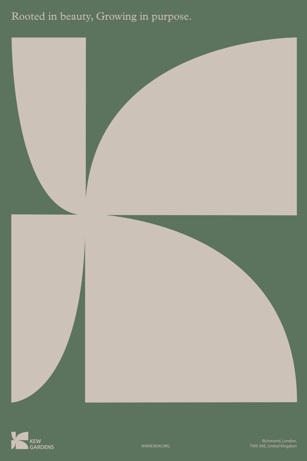
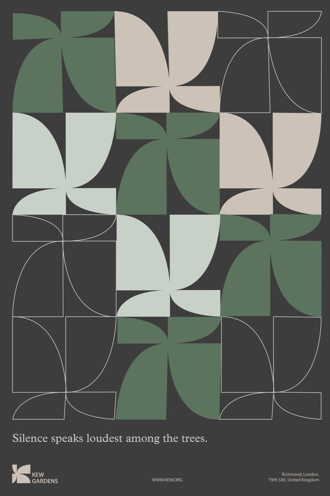
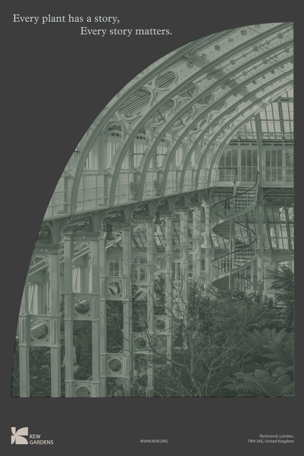
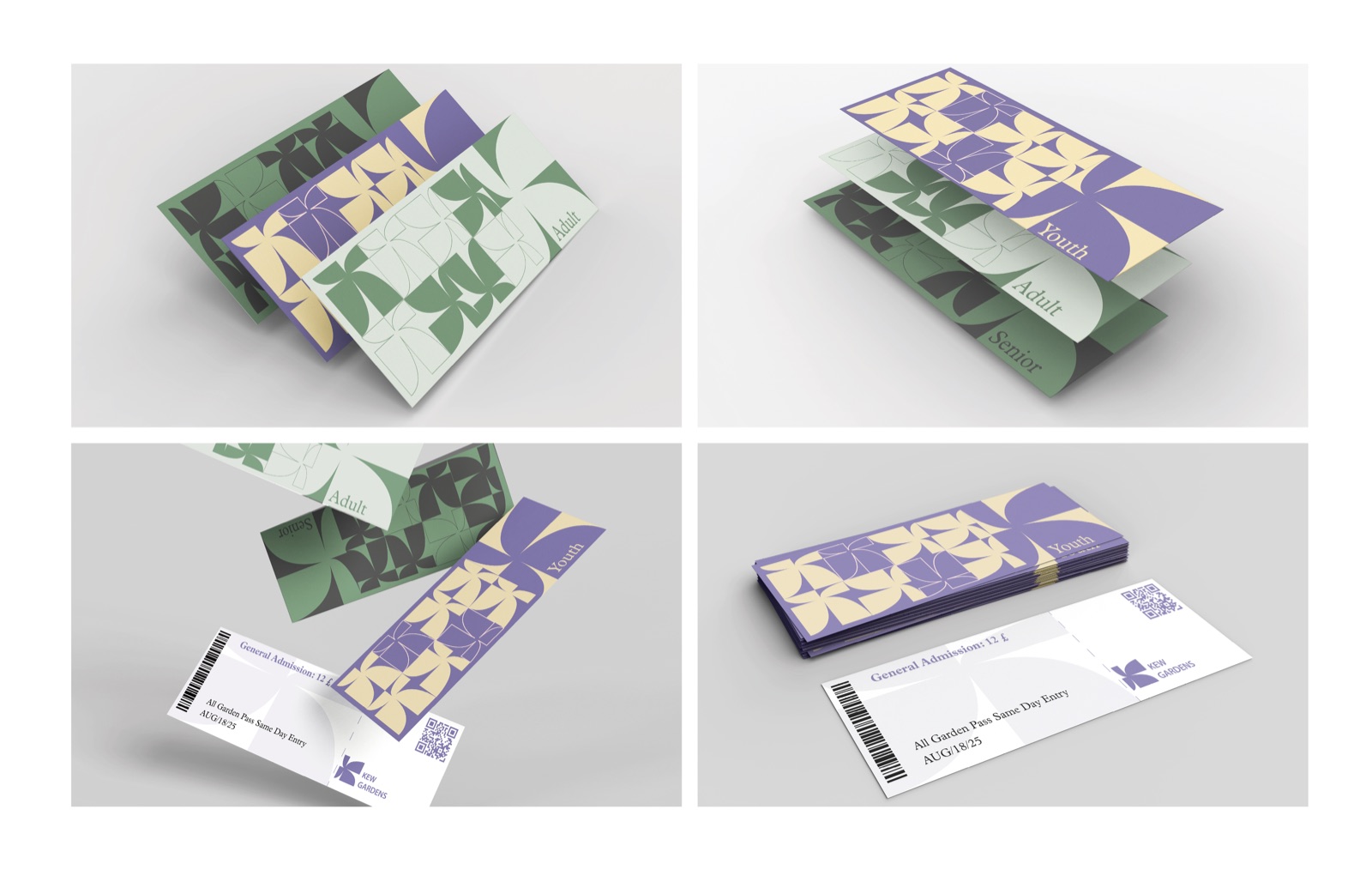
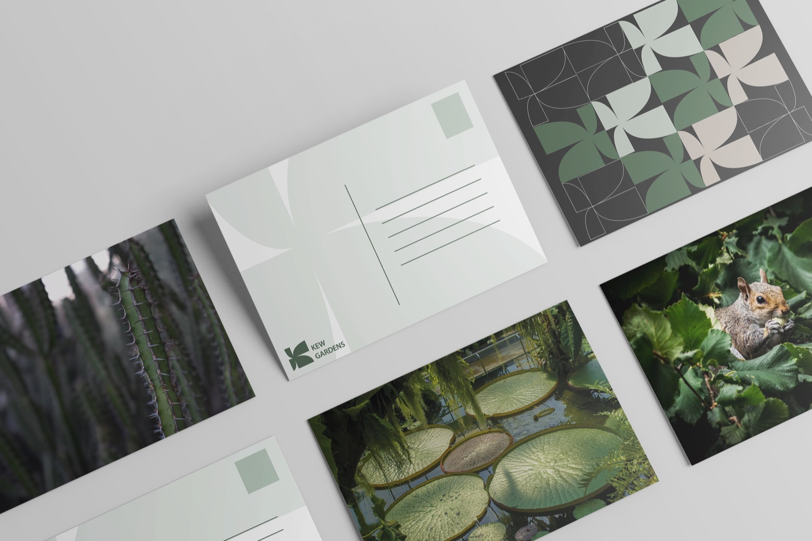
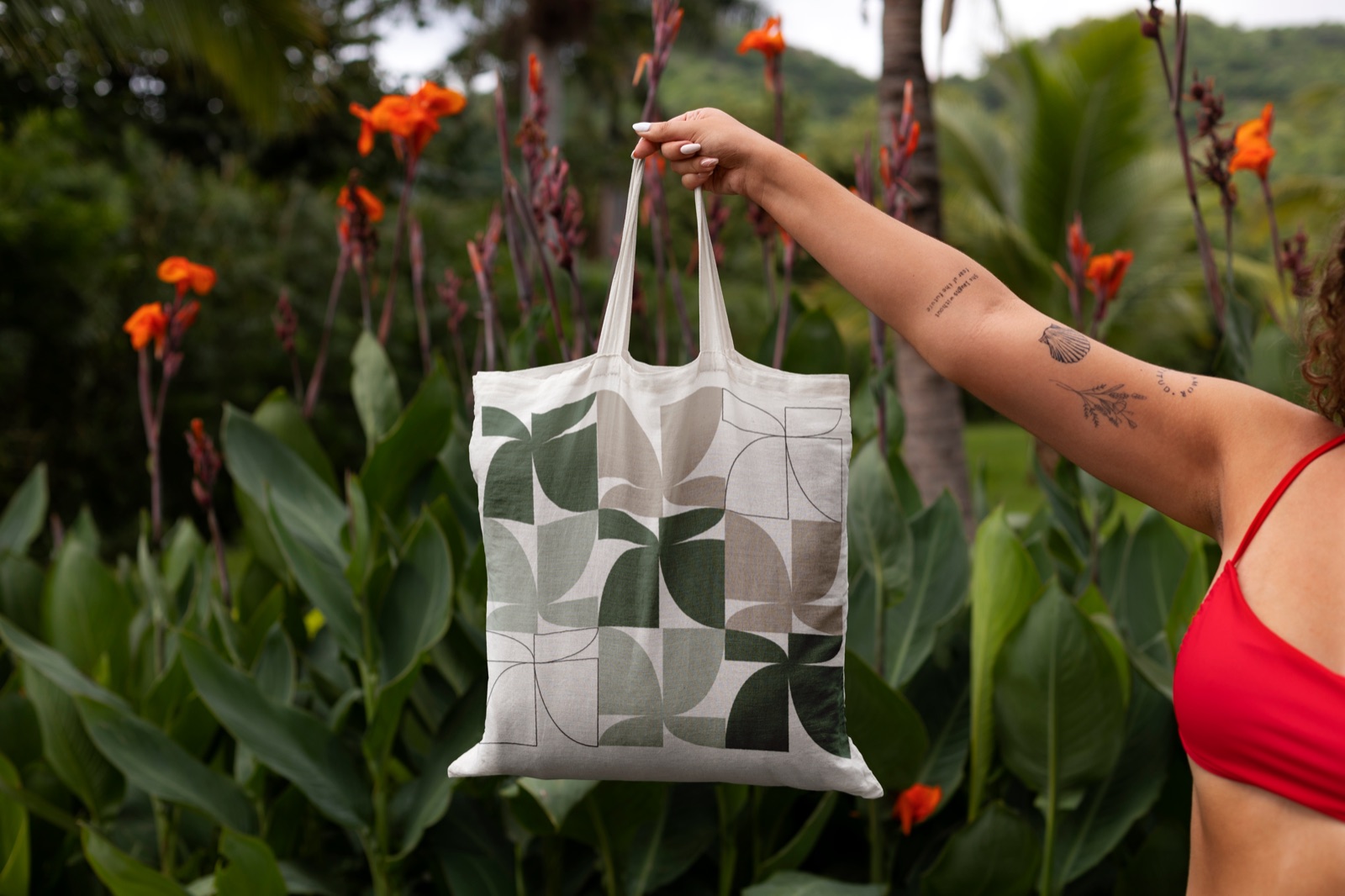
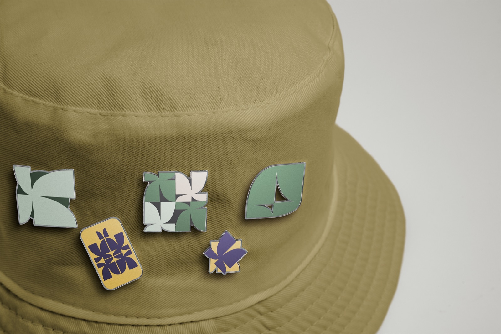
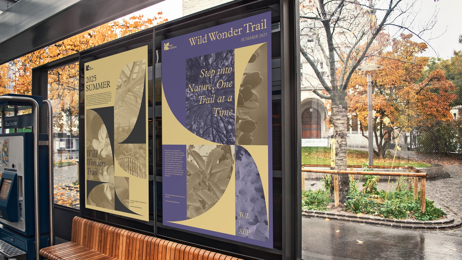
A modernized rebranding of the Royal Botanic Gardens, Kew, made with Yizhi Zhang. The old serif wordmark felt distant, so the new mark is a K built from leaf forms — botanical illustration distilled into clean geometry, a symbol that reads across languages for Kew’s international visitors. A muted grey-green, taken from herbarium specimens and the British landscape, carries the system from motion and wayfinding to posters, tickets, postcards and merchandise.

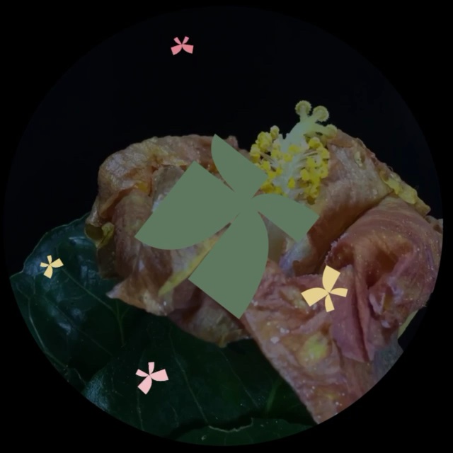 Spring
 Summer
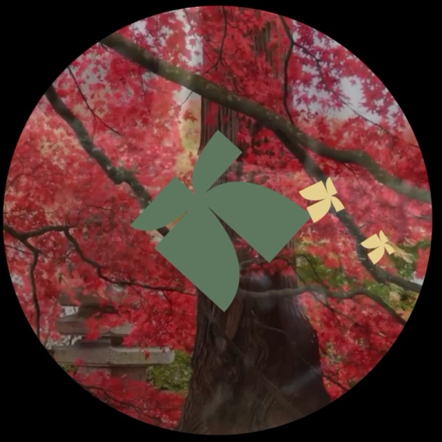 Autumn
 Winter
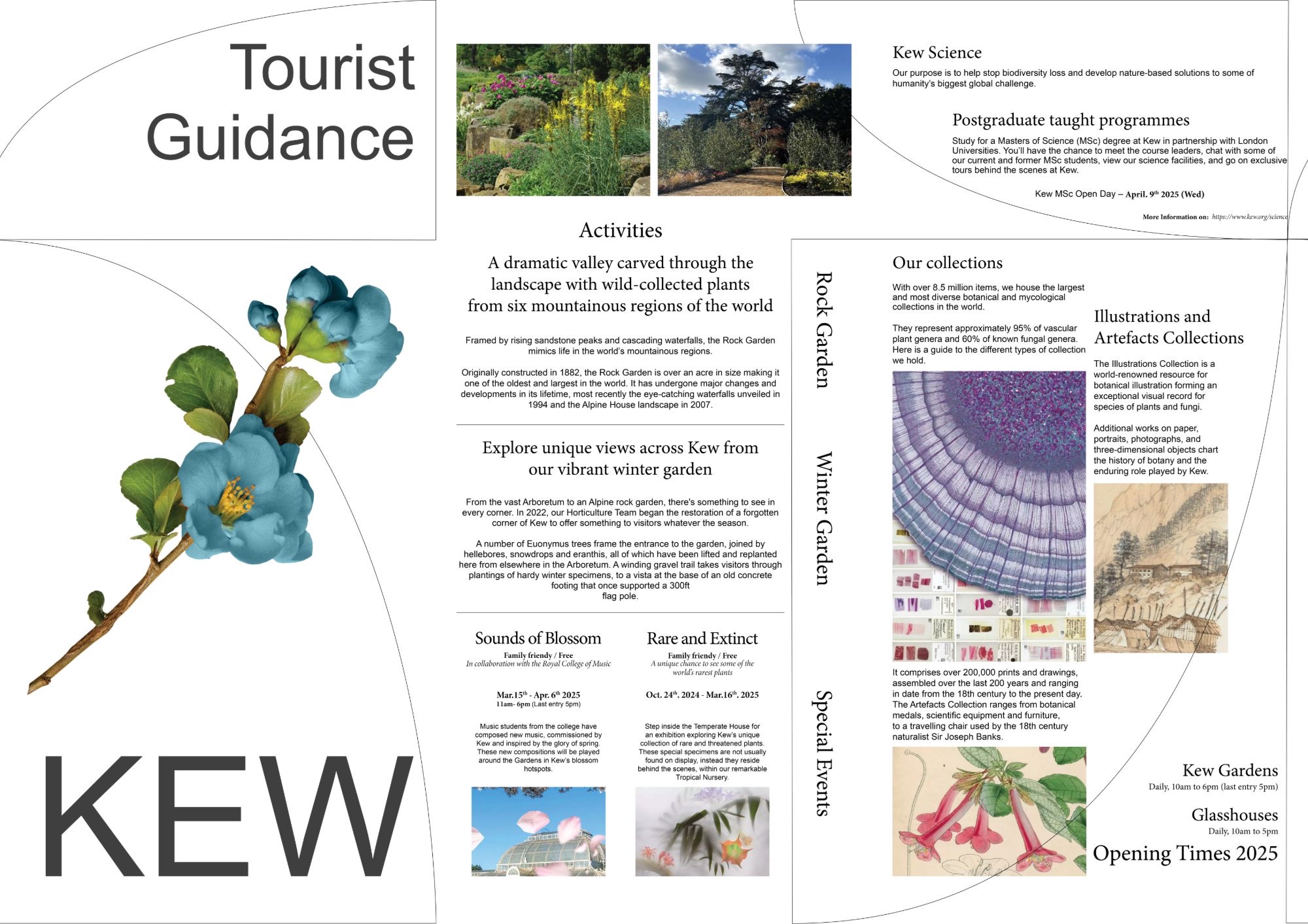 Visitor guide, outside — activities, collections, opening times
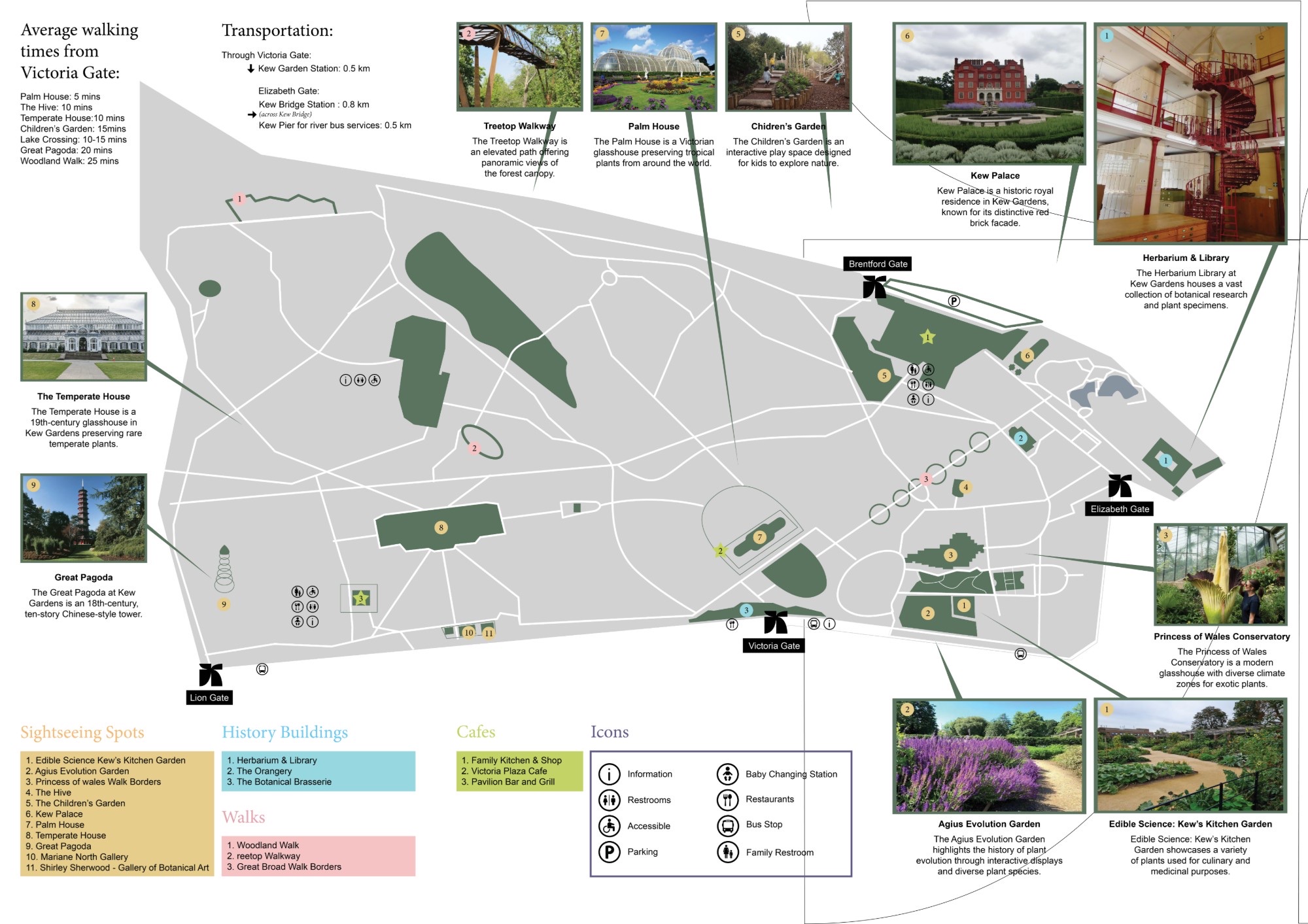 Visitor guide, inside — garden map with sights, gates, icons and walking times